Creating UIUX for SaaS company
September 2021
Redesigning the Landing Page with the Evolving Product
One of the most interesting things about working in a startup is how fast the company and the product evolves. Only two months after the initial landing page design, our developers launched two more core functions for Deploifai, rendering the UI obsolete.
Original Landing Page design
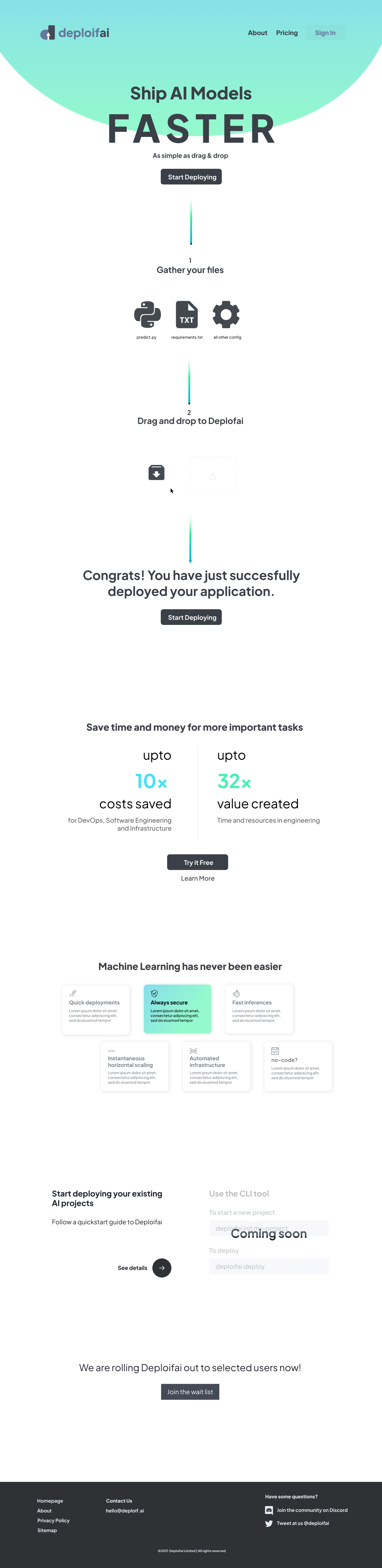
When proceeding with the redesign, I kept the elements that received positive feedback (simplicity
& engagement with vector animations) and focused on adding what potential users will be looking for
in trying a new MLOps product.
Research
Once I have gathered our needs, I researched the websites of our competitors featured on MLOps.toys
to see what elements that our potential users will be looking for on the landing page.
Through my research, I picked out the elements that should be our priority in redesigning.
🖊 Checklist
Creating the Header Animation
Since I have joined Deploifai, I kept a subtle outer space theme throughout the product as a
wordplay to the verb 'deploy' also being used for sending a satellite into orbit.
I first designed the elements on Adobe Illustrator and imported the vectors in Adobe
Aftereffect to animate them. Then I exported it into a Lottie file, an SVG animation, to allow
faster loading speed when embedded into the landing page.
Each of the three planets represents to three steps
in MLOps that Deploifai automates and supports.
Presenting a convincing product walkthrough
Creating a simple functional product walkthrough was a challenge as it required significant
collaboration with the engineering team. I did not have the advanced technical background to
explain the intricate selling points of the platform.
After discussion with the engineering team, I learned that many developers refer to the
Documentation page to determine whether the product will be compatible with their projects.
Instead, the landing page should target the business decision-making-units (DMU) such as Buyers
and Deciders.
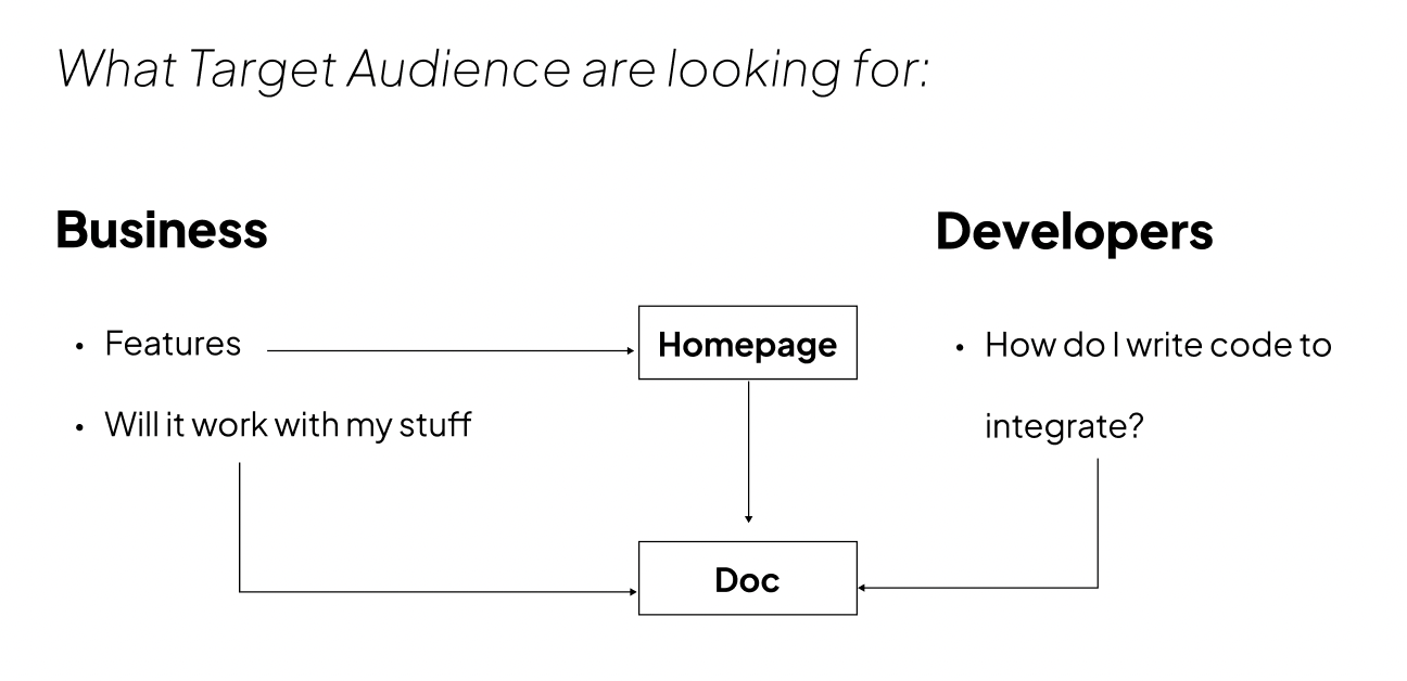
Target Audience User Flow
Therefore, we briefly outlined the functions of each core feature and the integrations supported. We also produced a few step-by-step tutorial videos averaging approximately 5 minutes each and embedded them as a pop-up player within the same page. This served the purpose of keeping the visitors on the page longer as well as keeping the user experience light and responsive.
Minimizing stress with industry-standard integrations
The key brand value of Deploifai is minimizing friction and time in every stage of MLOps. The
purpose of many MLOps tools in the market is to save the users time and money. While this might
be true, many platforms have an entry barrier or a steep learning curve.
Therefore, we saw an opportunity in emphasizing the minimal friction in adopting our platform
by clearly listing out industry-standard integrations. Simple copywriting like "Bring your own cloud
service" was adopted for the same rationale.
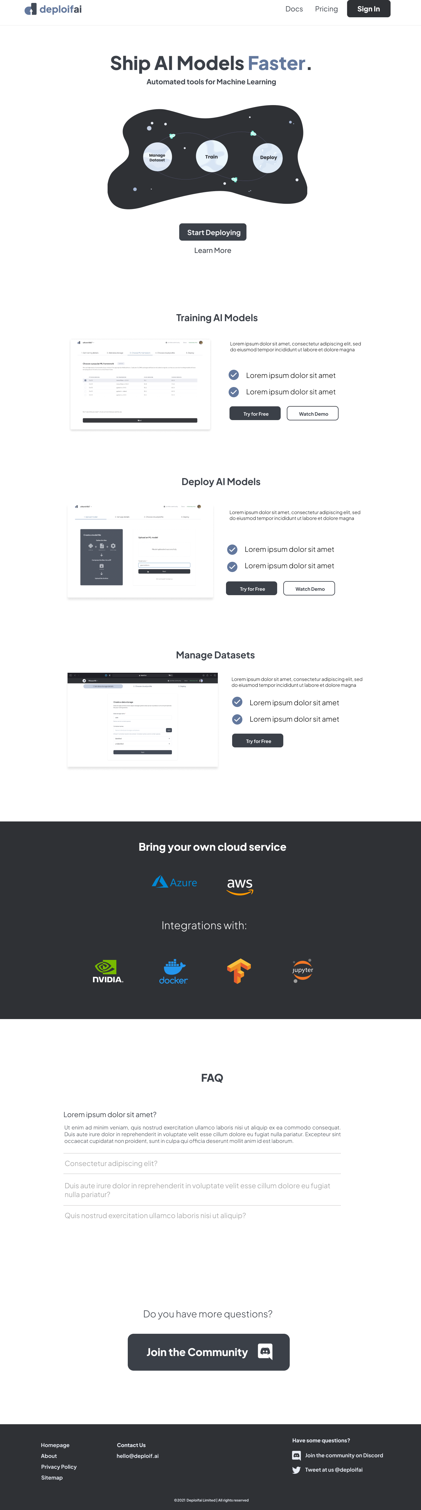
Final Product
You can check it out live here
Final Comments
Some adjustments were made in the UI in the development stage to adapt to the reactive layout (i.e: mobile version). Overall, we moved away from the gradient theme from the original website design and adopted a more toned-down theme of navy blue and dark grey to look professional.